PixiDom - v1.0.0
PixiDom


A lightweight UI component library for PixiJS that provides DOM-like interactive elements. Build text inputs, buttons, toggles, sliders, and scrollable lists directly in your PixiJS applications.
Features
- Full PixiJS Integration - Works seamlessly with PixiJS v4, v5, v6, v7, and v8
- TextField - Text input with cursor, selection, and keyboard handling
- Button - Customizable buttons with hover/pressed states
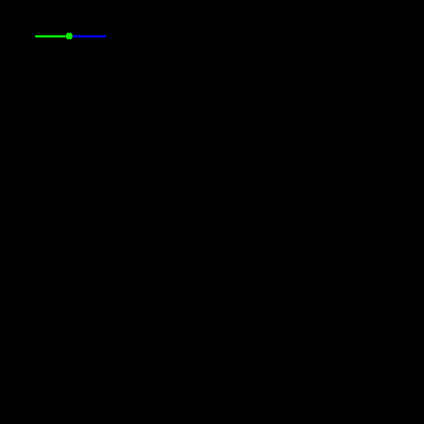
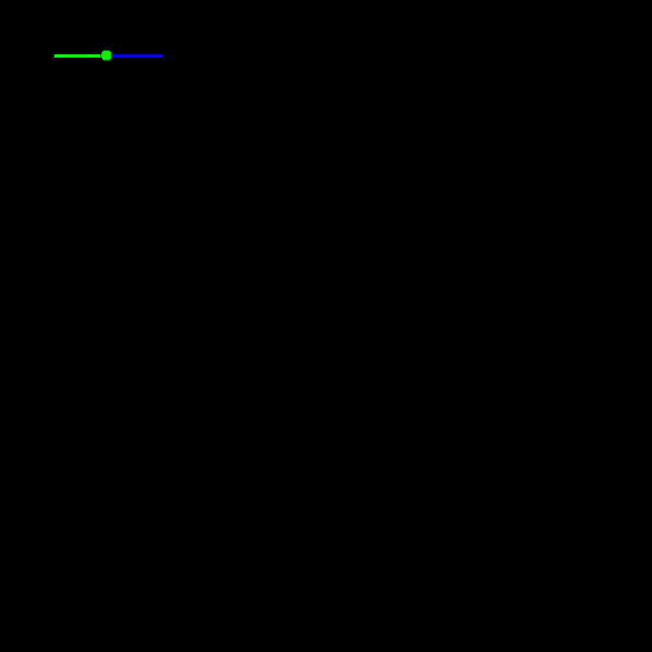
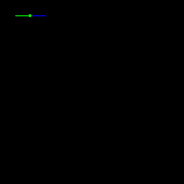
- Slider - Draggable value slider with customizable appearance
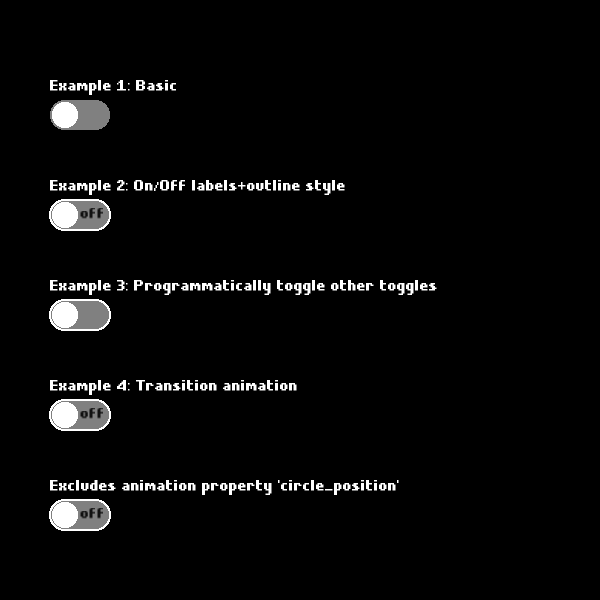
- Toggle - Animated toggle switches with labels
- ScrollList - Virtualized scrollable lists with optional scrollbar
- BitmapText Support - First-class support for bitmap fonts
- Lightweight - Zero dependencies beyond PixiJS
Installation
npm install pixidom.js
# or
yarn add pixidom.js
# or
pnpm add pixidom.js
Quick Start
ES Modules (Recommended)
import * as PIXI from 'pixi.js';
import { TextField, Button, Toggle, Slider, ScrollList, FontLoader } from 'pixidom.js';
UMD (Browser)
<script src="https://unpkg.com/pixi.js@8"></script>
<script src="https://unpkg.com/pixidom.js"></script>
<script>
const { TextField, Button, Toggle } = PIXI_DOM;
</script>
API Reference
Color
Every component option that accepts a color is typed as Color and accepts any of these formats:
| Format | Example | Notes |
|---|---|---|
| Hex int | 0xe7e7e7 |
Plain integer (0..0xffffff) |
| Hex string | '#e7e7e7', '#fff', '#fff8', '#e7e7e7ff' |
# optional; 0x prefix also accepted; 3, 4, 6, or 8 digits |
| RGB(A) object | { r: 231, g: 231, b: 231 } or { r: 231, g: 231, b: 231, a: 0.5 } |
Channels 0–255; alpha 0–1 (defaults to 1) |
| RGB(A) tuple | [231, 231, 231] or [231, 231, 231, 0.5] |
Same channel ranges as the object form |
Channel values outside their valid ranges are clamped (e.g. r: 300 → 255). Malformed inputs ('#zz', null, { r: 1 } missing g/b) throw a TypeError so bugs surface during development.
Where a component also exposes a separate *Opacity option (e.g. borderOpacity, backgroundOpacity, circleOutlineOpacity), the alpha component of the color is multiplied with that opacity.
import { normalizeColor, colorToInt } from 'pixidom.js';
// All of the following are equivalent:
normalizeColor(0xe7e7e7); // { value: 0xe7e7e7, alpha: 1 }
normalizeColor('#e7e7e7'); // { value: 0xe7e7e7, alpha: 1 }
normalizeColor({ r: 231, g: 231, b: 231 });
normalizeColor([231, 231, 231]);
// With alpha:
normalizeColor('#e7e7e780'); // { value: 0xe7e7e7, alpha ≈ 0.5 }
normalizeColor({ r: 231, g: 231, b: 231, a: 0.5 });
// Strip alpha when only the integer is needed:
colorToInt('#ff000080'); // 0xff0000
TextField
A fully-featured text input component with cursor navigation, text selection, and keyboard handling.
import { TextField, FontLoader } from 'pixidom.js';
// Load bitmap font first
const fontLoader = new FontLoader();
fontLoader.add('myFont', './fonts/myFont.fnt');
fontLoader.load(() => {
const textField = new TextField('myFont', {
width: '300px',
height: '32px',
backgroundColor: 0xffffff,
borderColor: 0x333333,
borderWidth: 1,
fontColor: 0x000000,
cursorColor: 0x000000,
xPadding: 5,
yPadding: 5,
});
stage.addChild(textField);
});
TextField Options
| Option | Type | Default | Description |
|---|---|---|---|
width |
string | number |
'500px' |
Width of the text field |
height |
string | number |
'16px' |
Height of the text field |
backgroundColor |
number |
0xf7f7f7 |
Background color (hex) |
borderColor |
number |
0x000000 |
Border color (hex) |
borderWidth |
number |
1 |
Border width in pixels |
fontColor |
number |
0x000000 |
Text color (hex) |
cursorColor |
number |
0x000000 |
Cursor color (hex) |
cursorWidth |
number |
1 |
Cursor width in pixels |
cursorHeight |
string | number |
'90%' |
Cursor height |
highlightedBackgroundColor |
number |
0x000080 |
Selection highlight color |
highlightedFontColor |
number |
0xffffff |
Selected text color |
xPadding |
number |
0 |
Horizontal padding |
yPadding |
number |
0 |
Vertical padding |
TextField Methods
// Focus/blur the text field
textField.focus();
textField.blur();
// Get/set text content
textField.change('New text');
// Clear the text field
textField.clear();
// Trigger submit action
textField.submit();
// Configure submit keys (default: Enter)
textField.submitKeyCodes = [13, 'Enter'];
// Configure keys to ignore
textField.ignoreKeys = [9]; // Ignore Tab
// Set maximum character length
textField.maxCharacterLength = 100;
TextField Events
textField.onFocus(() => console.log('Focused'));
textField.onBlur(() => console.log('Blurred'));
textField.onChange((text) => console.log('Text changed:', text));
textField.onSubmit(() => console.log('Submitted'));
Button
Interactive button component with customizable states for default, hover, and pressed appearances.
import { Button } from 'pixidom.js';
const button = new Button('Click Me', {
font: 'myFont',
useBitmapText: true,
defaultStyle: {
width: 120,
height: 40,
backgroundColor: 0x4a90d9,
textColor: 0xffffff,
borderRadius: 25,
},
hoverStyle: {
width: 120,
height: 40,
backgroundColor: 0x357abd,
textColor: 0xffffff,
borderRadius: 25,
},
pressedStyle: {
width: 120,
height: 40,
backgroundColor: 0x2a5f8f,
textColor: 0xffffff,
borderRadius: 25,
},
});
stage.addChild(button);
Button Style Options
| Option | Type | Description |
|---|---|---|
width |
number |
Button width |
height |
number |
Button height |
textColor |
number |
Text color (hex) |
backgroundColor |
number |
Background color (hex) |
backgroundTexture |
PIXI.Texture |
Background texture |
backgroundOpacity |
number |
Background opacity (0-1) |
borderColor |
number |
Border color (hex) |
borderWidth |
number |
Border width in pixels |
borderOpacity |
number |
Border opacity (0-1) |
borderRadius |
number |
Border radius percentage (0-100) |
Button Methods
// Update button text
button.text = 'New Label';
// Update style at runtime
button.updateStyle({ defaultStyle: { backgroundColor: 0xff0000 } });
// Event handlers (inherited from PixiElement)
button.onClick(() => console.log('Clicked!'));
button.onMouseOver(() => console.log('Hover'));
button.onMouseOut(() => console.log('Left'));
Toggle
Animated toggle switch with optional labels and customizable animations.
import { Toggle } from 'pixidom.js';
const toggle = new Toggle({
width: 60,
height: 30,
borderRadius: 50,
onBackgroundColor: 0x4cd964,
offBackgroundColor: 0xe5e5e5,
onCircleColor: 0xffffff,
offCircleColor: 0xffffff,
animationOptions: {
type: 'linear',
duration: 200,
},
labelOptions: {
fontName: 'myFont',
onLabel: 'ON',
offLabel: 'OFF',
onColor: 0xffffff,
offColor: 0x666666,
},
}, true); // Initial state: toggled on
stage.addChild(toggle);
Toggle Options
| Option | Type | Description |
|---|---|---|
width |
number |
Toggle width |
height |
number |
Toggle height |
borderRadius |
number |
Border radius percentage (0-100) |
onBackgroundColor |
number |
Background color when ON |
offBackgroundColor |
number |
Background color when OFF |
onCircleColor |
number |
Circle color when ON |
offCircleColor |
number |
Circle color when OFF |
backgroundOutline |
{ width, color } |
Optional outline |
animationOptions |
object |
Animation configuration |
labelOptions |
object |
Optional text labels |
Toggle Events
toggle.onToggle((isToggled) => {
console.log('Toggle state:', isToggled);
});
// Get/set toggle state
console.log(toggle.toggled); // true or false
toggle.toggled = false;
Slider
Draggable slider for numeric value selection with visual feedback.
import { Slider } from 'pixidom.js';
const slider = new Slider({
width: 200,
height: 4,
minValue: 0,
maxValue: 100,
startingValue: 50,
activeColor: 0x4a90d9,
inactiveColor: 0xcccccc,
circleRadius: 8,
circleColor: 0xffffff,
circleOutlineWidth: 2,
circleOutlineColor: 0x4a90d9,
hover: {
circleRadius: 10,
circleOutlineWidth: 3,
},
down: {
circleRadius: 12,
circleColor: 0x4a90d9,
},
});
stage.addChild(slider);
Slider Options
| Option | Type | Description |
|---|---|---|
width |
number |
Slider track width |
height |
number |
Slider track height |
minValue |
number |
Minimum value |
maxValue |
number |
Maximum value |
startingValue |
number |
Initial value |
activeColor |
number |
Active (filled) track color |
inactiveColor |
number |
Inactive track color |
circleRadius |
number |
Handle radius |
circleColor |
number |
Handle color |
circleOutlineWidth |
number |
Handle outline width |
circleOutlineColor |
number |
Handle outline color |
hover |
object |
Style overrides on hover |
down |
object |
Style overrides when pressed |
Slider Events
slider.on('slider-change', (value) => {
console.log('Slider value:', value);
});
// Get current value
console.log(slider.currentValue);
ScrollList
Virtualized scrollable list with optional scrollbar, touch support, and mouse wheel scrolling.
import { ScrollList } from 'pixidom.js';
const items = Array.from({ length: 100 }, (_, i) => {
const container = new PIXI.Container();
const text = new PIXI.Text(`Item ${i + 1}`, { fontSize: 16 });
container.addChild(text);
return { container };
});
const scrollList = new ScrollList(
{
width: '300px',
height: '400px',
backgroundColor: 0xffffff,
dividerColor: 0xeeeeee,
dividerPixelHeight: 1,
dividerPercentWidth: 100,
dividerTopPadding: 5,
dividerBottomPadding: 5,
xPadding: 10,
yPadding: 10,
scrollBarOptions: {
width: 8,
backgroundColor: 0xe0e0e0,
scrollerColor: 0x888888,
borderRadius: 50,
},
},
items
);
stage.addChild(scrollList);
ScrollList Performance Options
const scrollList = new ScrollList(styleOptions, items, {
disableScrollWheelScroll: false,
disableTouchScroll: false,
visibilityBuffer: 200, // Pixels of buffer for virtualization
adjustVisibilityTime: 130,
});
PixiElement
Base class for interactive elements with event handling, drag support, and swipe gestures.
import { PixiElement } from 'pixidom.js';
const element = new PixiElement();
// Mouse events
element.onMouseDown((event) => {});
element.onMouseUp((event) => {});
element.onMouseOver((event) => {});
element.onMouseOut((event) => {});
element.onClick((event) => {});
// Drag events
element.onDragStart((event) => {}, holdTime);
element.onDragMove((event) => {});
element.onDragEnd((event) => {});
// Swipe gestures
element.onSwipe((direction, velocity) => {});
// Centering utilities
element.center();
element.centerX();
element.centerY();
FontLoader
Cross-version bitmap font loader that works with PixiJS v4-v8.
import { FontLoader } from 'pixidom.js';
const fontLoader = new FontLoader();
fontLoader.add('small', './fonts/small.fnt');
fontLoader.add('medium', './fonts/medium.fnt');
fontLoader.load(() => {
console.log('Fonts loaded!');
// Now you can use the fonts with TextField, Button, etc.
});
Utility Functions
import {
utils,
getPixiVersion,
resolvePixiRenderer,
renderContainer,
createBitmapText,
ensurePixiCanvasFallback,
} from 'pixidom.js';
// Get current PixiJS version
const version = getPixiVersion(); // e.g., 8
// Create a renderer (handles version differences)
const renderer = await resolvePixiRenderer({
width: 800,
height: 600,
canvas: document.getElementById('canvas'),
});
// Render a container
renderContainer(renderer, stage);
// Center a PixiJS object within its parent
utils.centerPixiObject(sprite);
// Convert color string to hex
const hex = utils.string2hex('#ff0000'); // 0xff0000
// Normalize any Color input to a { value, alpha } pair
utils.normalizeColor('#ff000080'); // { value: 0xff0000, alpha ≈ 0.5 }
utils.normalizeColor({ r: 255, g: 0, b: 0 }); // { value: 0xff0000, alpha: 1 }
utils.colorToInt([255, 0, 0, 0.5]); // 0xff0000 (alpha discarded)
🧪 Development
Setup
git clone https://github.com/visgotti/PixiDom.git
cd PixiDom
npm install
Scripts
# Start development server
npm run dev
# Build the library
npm run build
# Run unit tests
npm test
# Run E2E tests (Playwright)
npm run test:e2e
# Update E2E snapshots
npm run test:e2e:update
# Serve examples locally
npm run serve:examples
# Generate documentation
npm run docs
Running Examples
npm run serve:examples
Then open http://localhost:4173 in your browser to see all component demos.
🔧 PixiJS Version Compatibility
PixiDom automatically adapts to the version of PixiJS you're using:
| PixiJS Version | Status |
|---|---|
| v4.x | ✅ Supported |
| v5.x | ✅ Supported |
| v6.x | ✅ Supported |
| v7.x | ✅ Supported |
| v8.x | ✅ Supported |
How it picks up your PixiJS
PixiDom imports pixi.js through a peer dependency, so whichever version you install is the one it uses. There is no init step, no window.PIXI = PIXI hand-off, and no version-specific configuration. Importing the package once is enough:
import { Button } from 'pixidom.js';
For UMD <script> users, load your PixiJS UMD bundle first (any of v4–v8), then pixidom.js — window.PIXI is detected automatically.
Caveats by version
- v8 (modular ESM):
import { Button } from 'pixidom.js'works directly. You do not need to importpixi.js/app,pixi.js/graphics, etc. — PixiDom's bootstrap loads the mainpixi.jsentry, which already re-exports the full surface. - v8 with strict ESM: ES module namespaces are frozen, so PixiDom copies the imported
pixi.jsinto a mutableglobalThis.PIXIfor legacyPIXI.Xconsumers. Your ownimport * as PIXI from 'pixi.js'is unaffected — it still resolves to the same module instance via peer-dep hoisting. - v7 → v8 migration: Some shape changes are smoothed over by the adapter (
Application.init(),events.setTargetElement, the Graphics fluent API). Cross-version code using PixiDom should not need version branches; if you hit one, file an issue. - v4 (CJS-only): Loaders are pre–
Assets. UsegetPixiLoader()/newPixiLoader()from PixiDom rather than reaching forPIXI.Loaderdirectly — the adapter normalizes the v4 vs v5+ vs v7+ loader differences. - v4–v6 Graphics fluent API (
beginFill/drawRect/endFill) and v8 fluent API (rect().fill()) are both supported. PixiDom installs a small compatibility shim onGraphics.prototypeso your component code can use either form regardless of installed version. - Multiple PixiJS versions in your dependency tree: if your bundler resolves more than one copy of
pixi.js,globalThis.PIXIwill point at whichever copy PixiDom resolved, which may differ from the one your app code imported. This is the standard peer-dep hazard — pin a singlepixi.jsversion in your rootpackage.jsonto avoid it. - TypeScript types: PixiDom ships its own version-agnostic
PIXInamespace shim. If you want strict v8 types in your own code,import * as PIXI from 'pixi.js'directly — both can coexist.
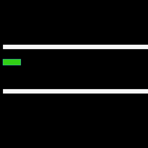
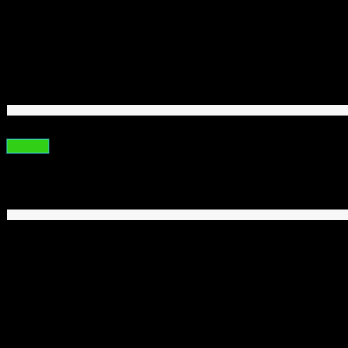
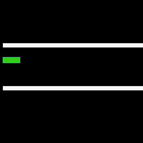
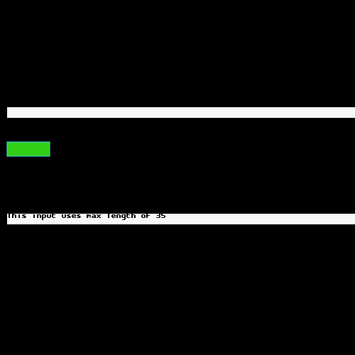
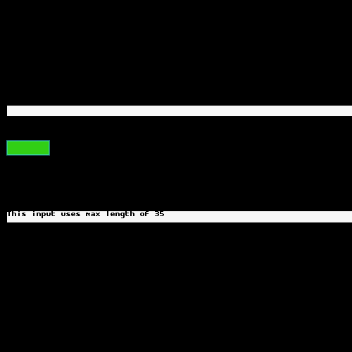
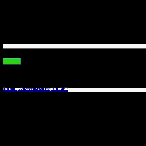
Visual Parity Across Versions
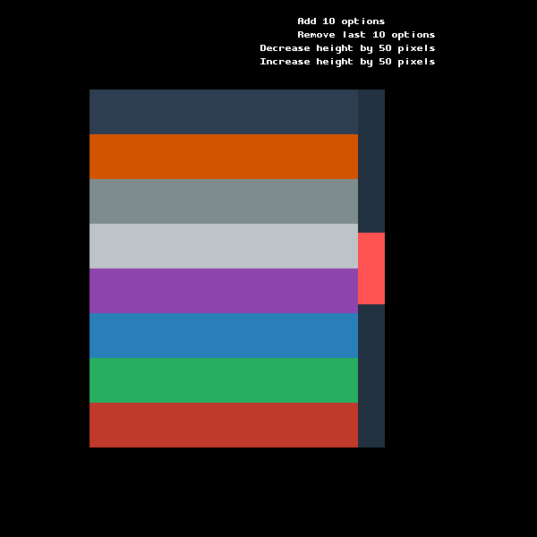
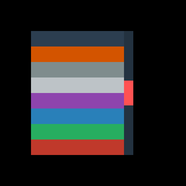
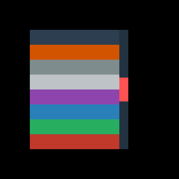
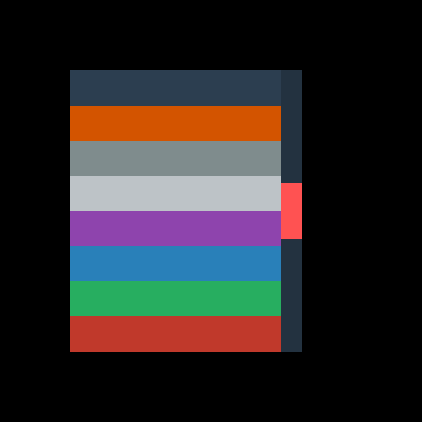
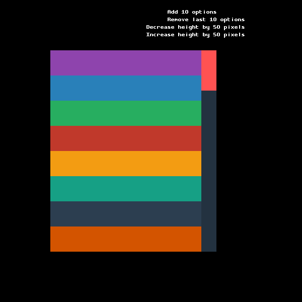
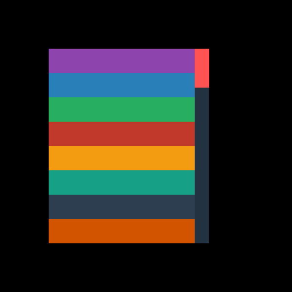
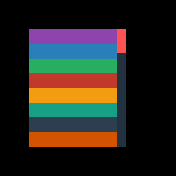
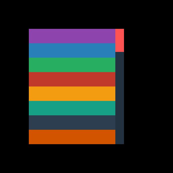
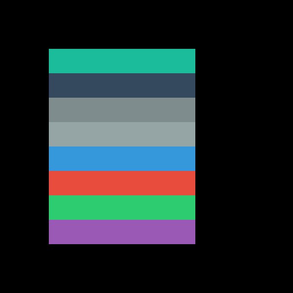
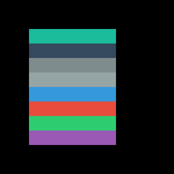
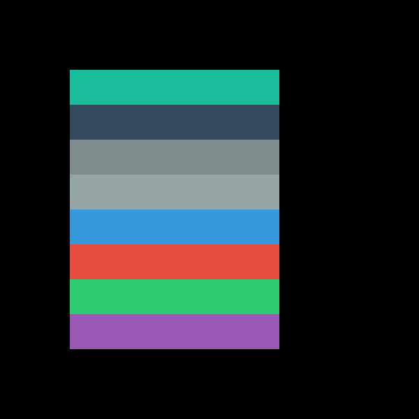
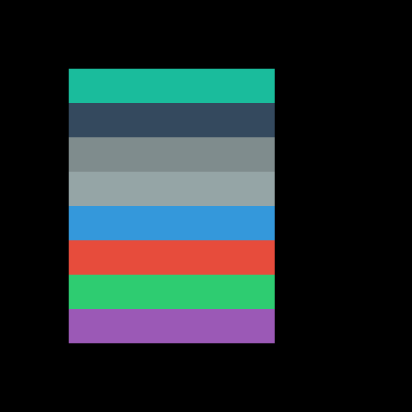
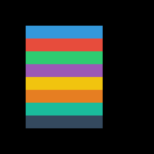
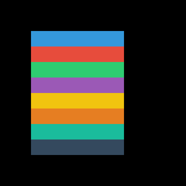
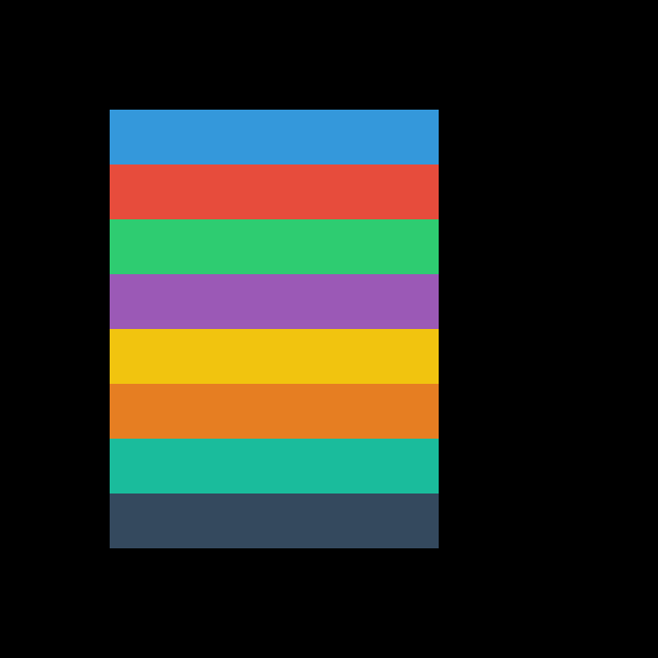
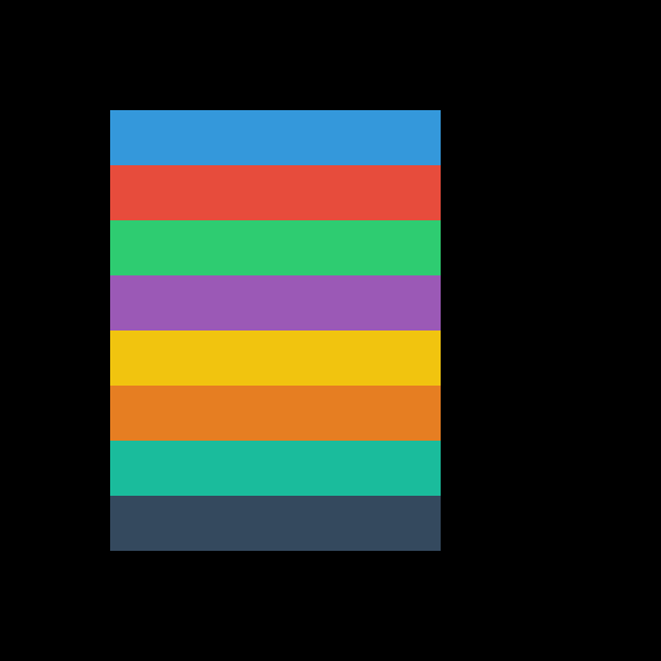
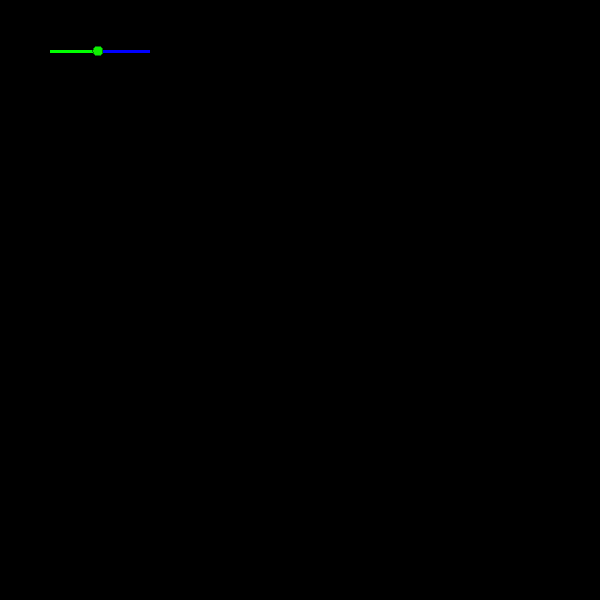
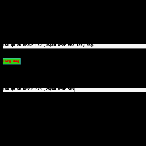
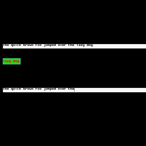
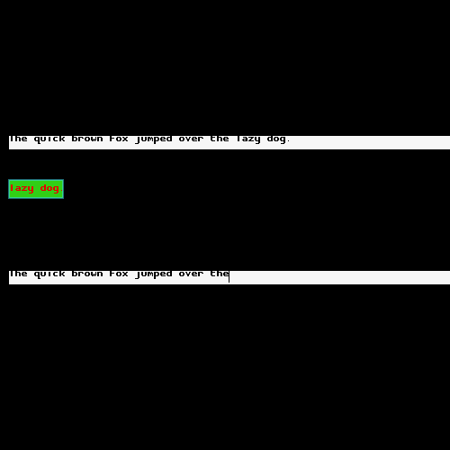
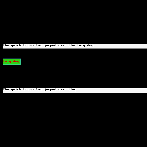
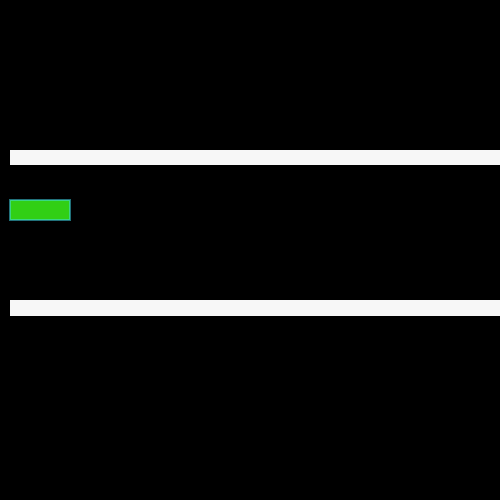
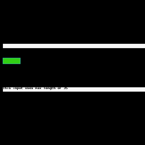
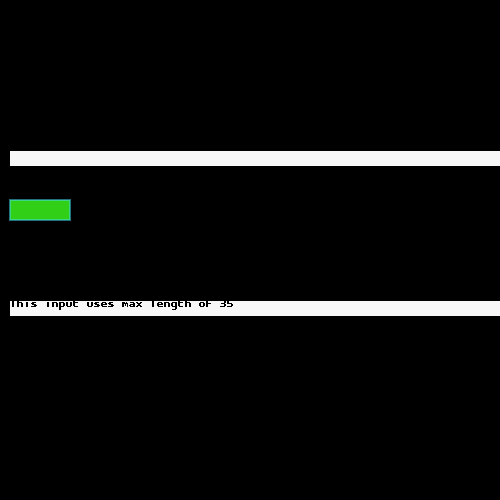
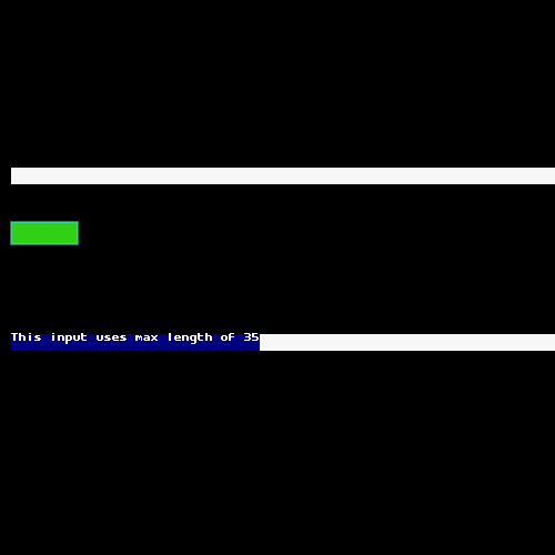
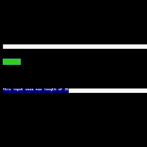
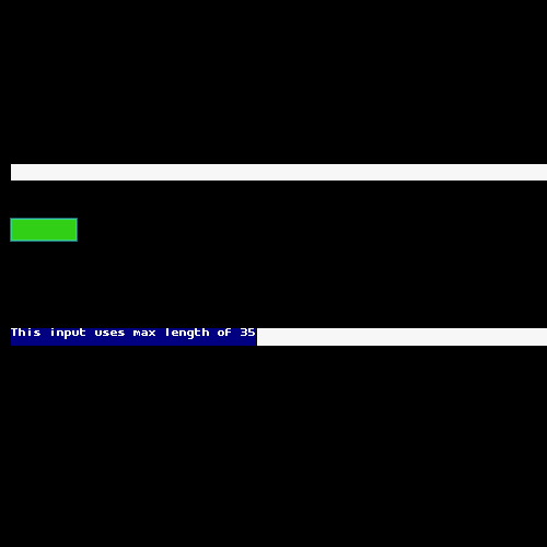
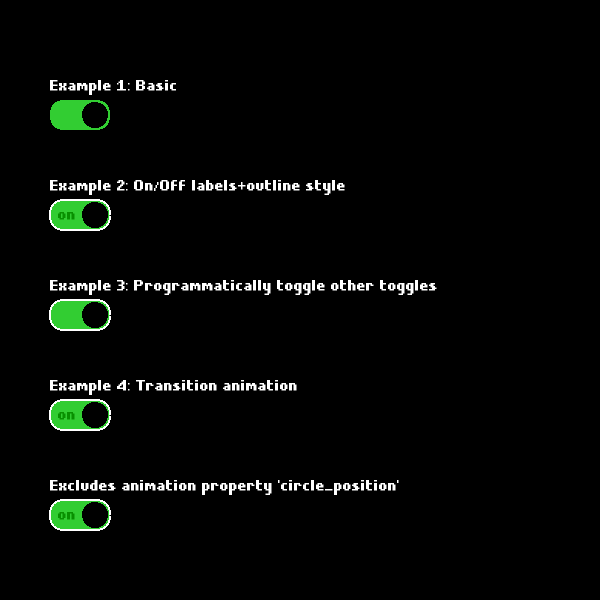
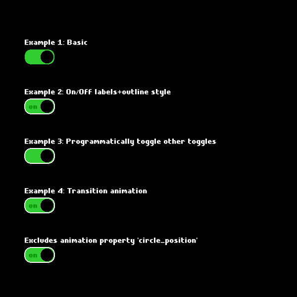
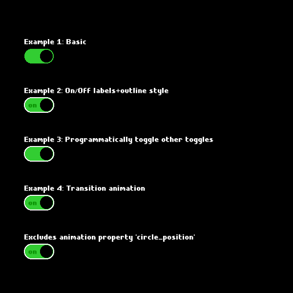
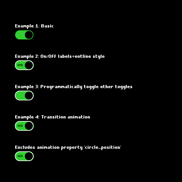
Every component is exercised by Playwright against PixiJS v4 through v8 with a 97% pixel-match threshold. The current baselines:
Button
| State | pixi4 | pixi5 | pixi6 | pixi7 | pixi8 |
|---|---|---|---|---|---|
| Default |  |
 |
 |
 |
 |
Element
| State | pixi4 | pixi5 | pixi6 | pixi7 | pixi8 |
|---|---|---|---|---|---|
| Default |  |
 |
 |
 |
 |
ScrollList (with scrollbar)
| State | pixi4 | pixi5 | pixi6 | pixi7 | pixi8 |
|---|---|---|---|---|---|
| After Scroll | 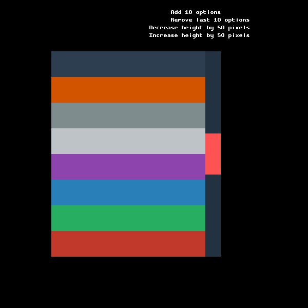 |
 |
 |
 |
 |
| Before Scroll | 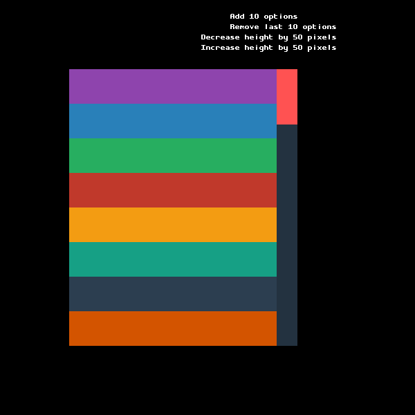 |
 |
 |
 |
 |
ScrollList (without scrollbar)
| State | pixi4 | pixi5 | pixi6 | pixi7 | pixi8 |
|---|---|---|---|---|---|
| After Scroll | 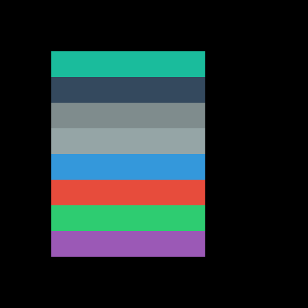 |
 |
 |
 |
 |
| Before Scroll | 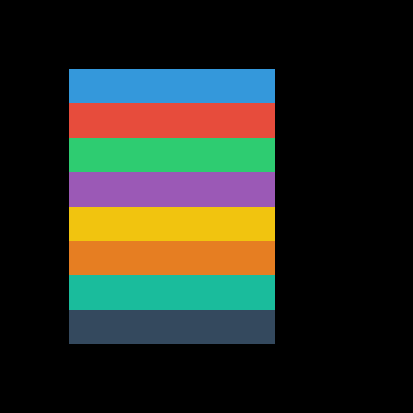 |
 |
 |
 |
 |
Slider
| State | pixi4 | pixi5 | pixi6 | pixi7 | pixi8 |
|---|---|---|---|---|---|
| Default | 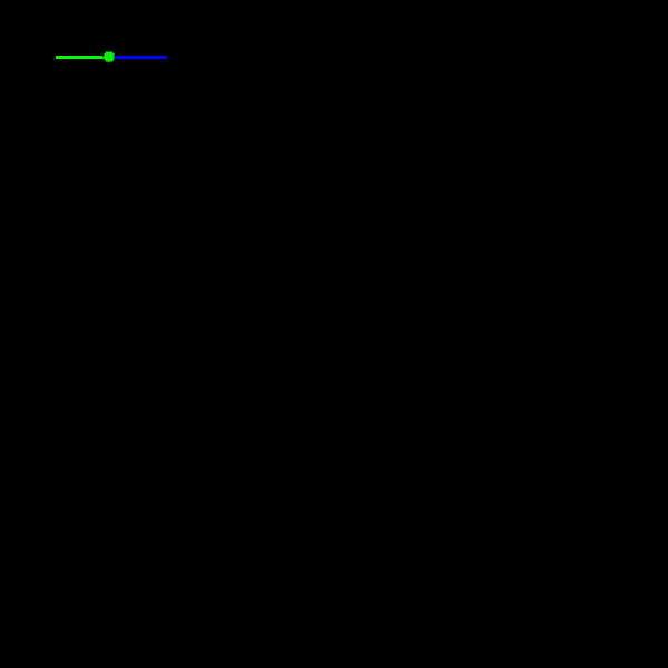 |
 |
 |
 |
 |
TextField
| State | pixi4 | pixi5 | pixi6 | pixi7 | pixi8 |
|---|---|---|---|---|---|
| After | 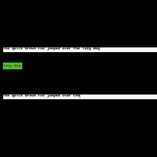 |
 |
 |
 |
 |
| After Backspace | 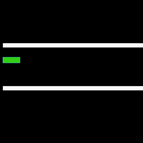 |
 |
 |
 |
 |
| Before | 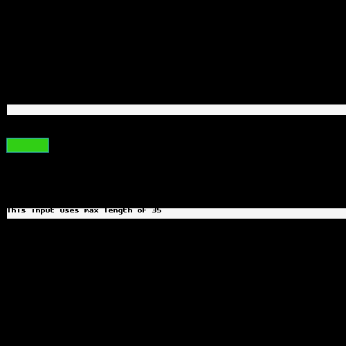 |
 |
 |
 |
 |
| Select All | 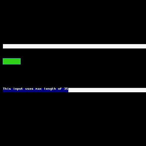 |
 |
 |
 |
 |
Toggle
| State | pixi4 | pixi5 | pixi6 | pixi7 | pixi8 |
|---|---|---|---|---|---|
| After | 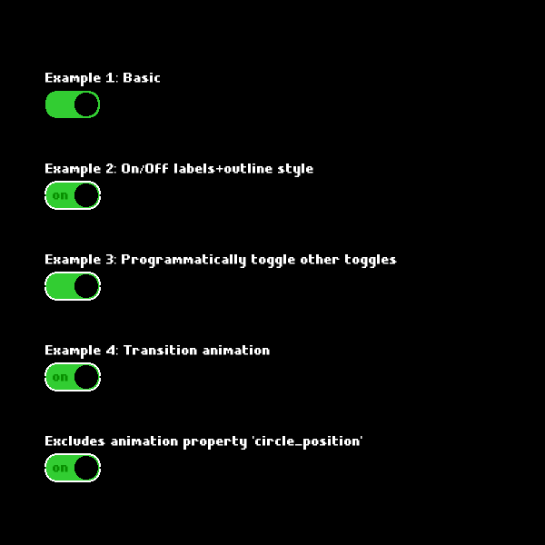 |
 |
 |
 |
 |
| Before | 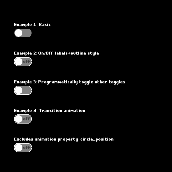 |
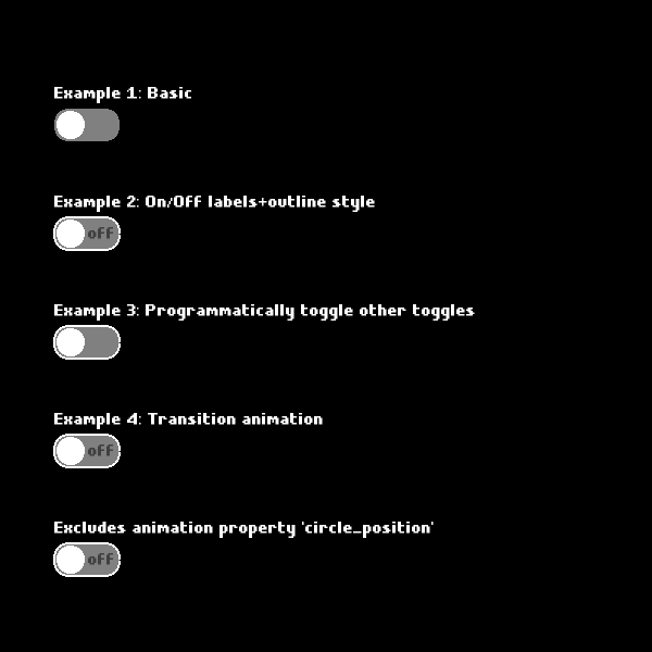 |
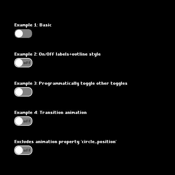 |
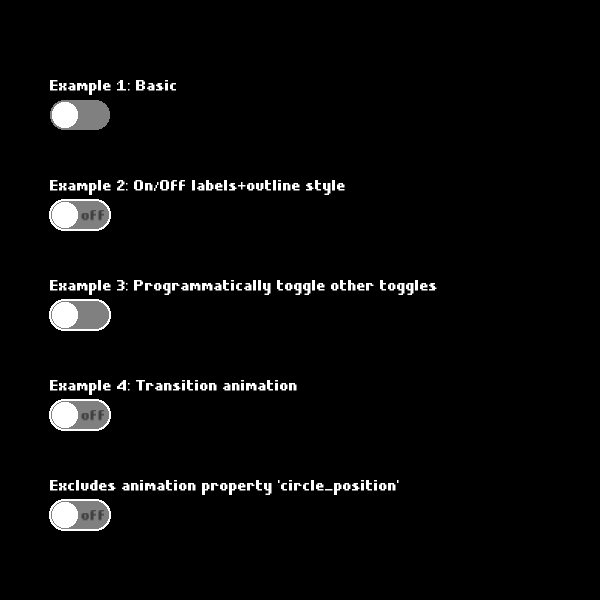 |
 |
Run
npm run snapshot-report:readmeto regenerate this section after updating snapshots.
📄 TypeScript Support
PixiDom is written in TypeScript and includes full type definitions. Import types directly:
import type {
ButtonStyleOptions,
ToggleOptions,
ScrollStyleOptions,
StyleOptionsParams,
} from 'pixidom.js';
🤝 Contributing
Contributions are welcome! Please read our Contributing Guide for details.
- Fork the repository
- Create your feature branch (
git checkout -b feature/amazing-feature) - Commit your changes (
git commit -m 'Add amazing feature') - Push to the branch (
git push origin feature/amazing-feature) - Open a Pull Request
📝 License
This project is licensed under the MIT License - see the LICENSE file for details.